
A public and exhibiting artist.
About
Public Art
Murals
Collaboration
Exhibition
Sculpture
Shop
Cart
I acknowledge the Traditional Owners of the land that I live and work, the Wurundjeri Woi Wurrung People of the Kulin Nation and their ongoing connection to land, waters and culture. I also acknowledge that sovereignty was never ceded.

‘Transfer Here’ Penny Contemporary (Hobart) 2025


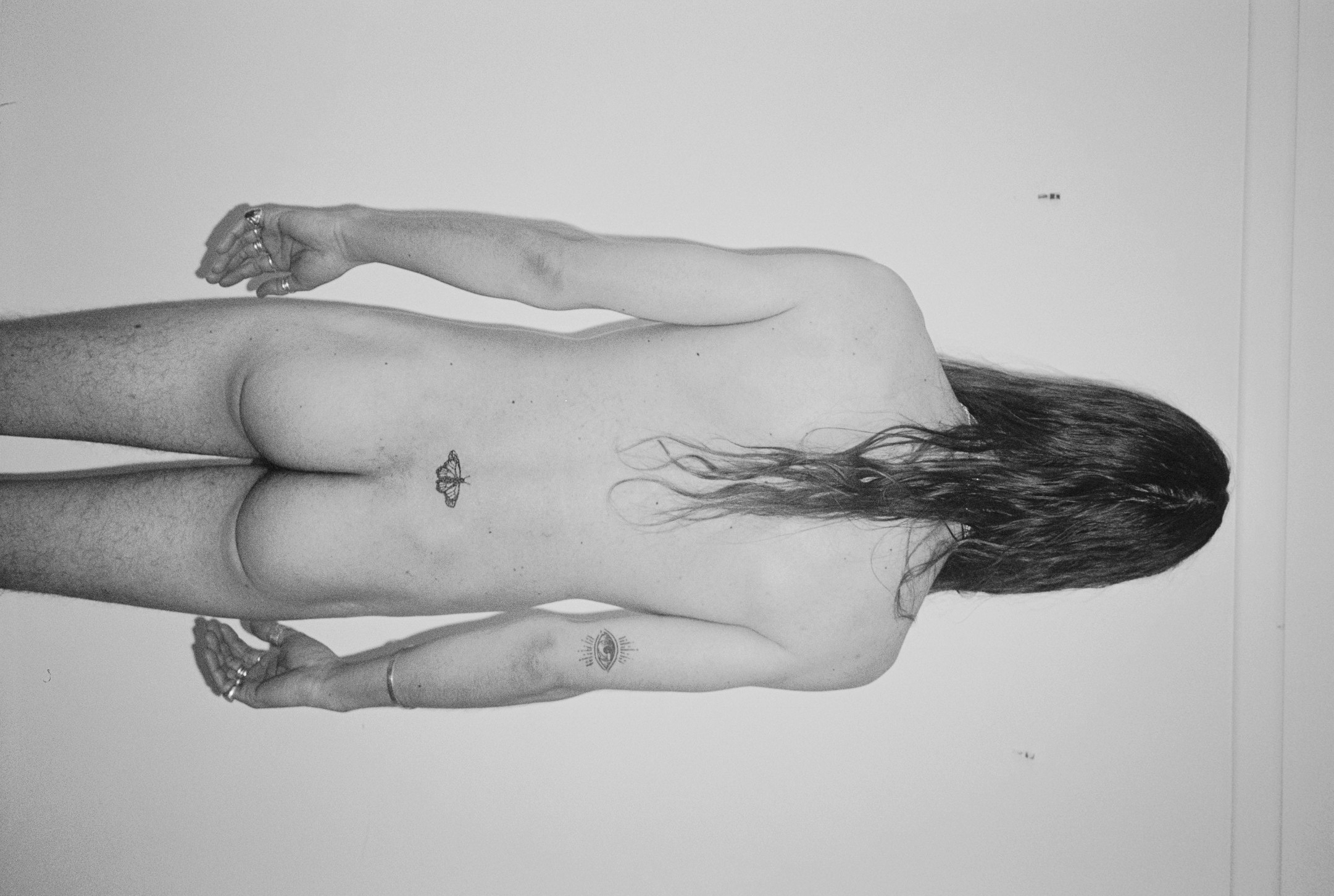
He Killed 9000 Butterflies - September 2019

external link to the film below (age resitricted)
‘Paths that don’t go where people want them to go’ MARS Gallery (Melbourne) February 2023
![]()
PATHS THAT DON’T GO WHERE PEOPLE WANT THEM TO:
AESTHETIC (UN)USABILITY IN THE PAINTINGS OF ABBEY RICH
an essay by Anna Emina El Samad
The first thing I noticed when meeting Abbey in the foyer at Schoolhouse Studios, on a quiet Sunday, was their socks. They were a perfect shade of aquamarine blue. I must have made a comment about them as I quickly discovered that it is Abbey's signature colour. Pops of the warm, deep blue appear regularly in their surroundings; I could spot it on the rim of their glasses, in the shapes on their Freitag bag, and in the background of their artwork. Abbey describes the colour as “opaque and dense, calm but also intense”. I had only been at Schoolhouse Studios for a few months and was relatively new to the art scene so it came as a shock to find a person with the same appetite for colour that I have. Ours is a visceral, obsessed, almost complete yearning to be in a world surrounded by colour.
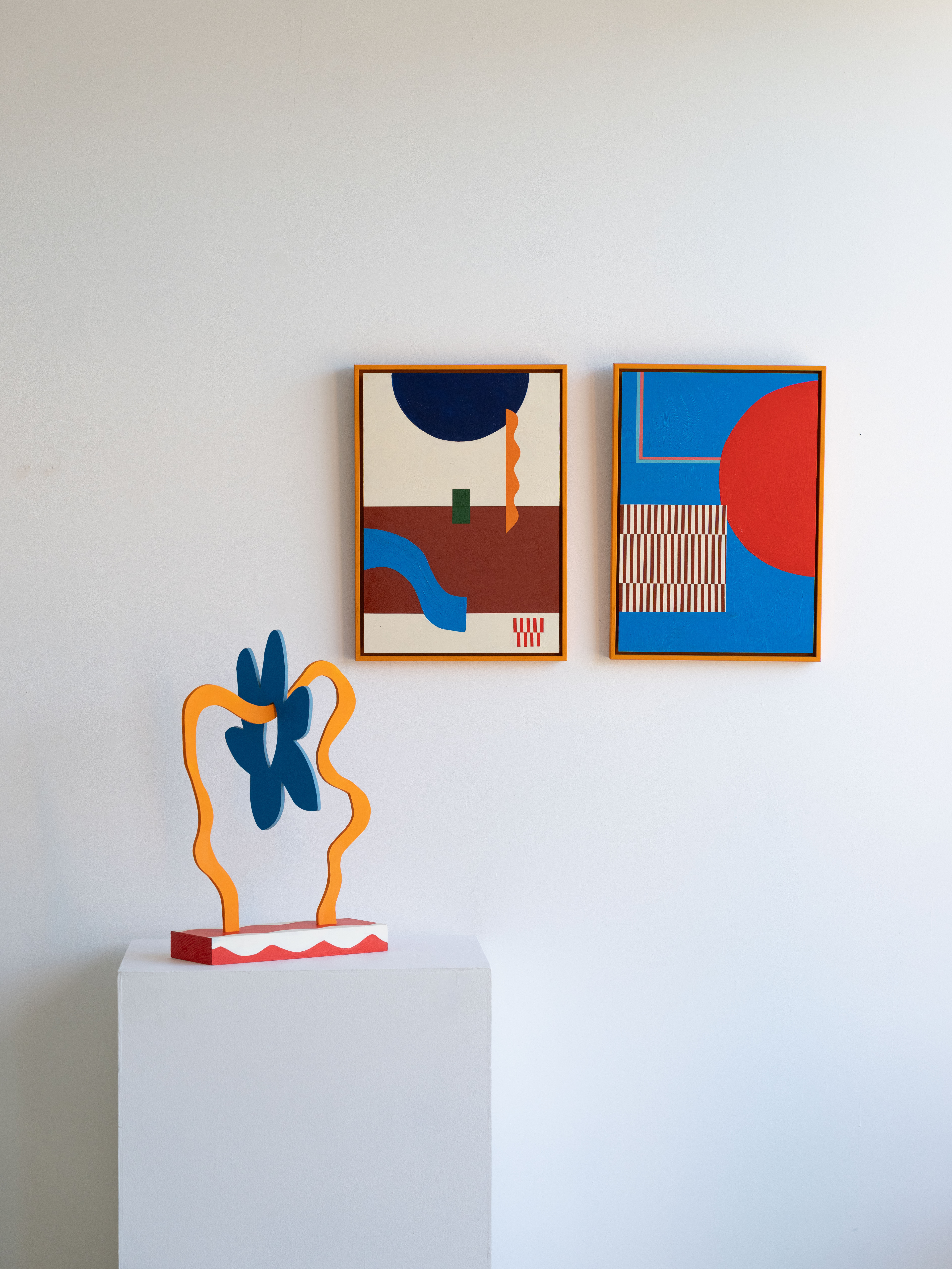
It would come as no surprise then, that my conversations with Abbey generally begin here. How could they not. Abbey has an ability to choose exactly the right tones, to incorporate different hues and shades. When we met, Abbey had just started developing a new body of work and I would often find myself in their studio, watching them paint. Their desk would be enveloped with tubs of the most incredible colours and I almost felt like an insect drawn to the light everytime I looked at their work. The yellows, oranges, browns, greens, pinks and blues; in neon and pastel; all perfectly chosen, in tones that have my colour-obsessed mind yearning for more. The embodiment of Abbey’s colour choices can be seen in the works for their latest exhibition at Mars Gallery. The exhibition is prolific, consisting of four sculptures, 17 paintings of different scales, two diptychs, and a mural.
‘Paths that don’t go where people want them to go’ is Abbey’s biggest show to date and is a culmination of their constantly evolving artistic practice. A former textile designer and tattoo artist, Abbey now focuses their practice on painting and murals. Viewing the work all together in their studio a week before they are taken to Mars, I can begin to see the common themes and symbols running throughout. Many of the paintings contain patterns and shapes. Mostly rectangles of differing sizes, aligned neatly on the canvas. The paintings are structured, perfect even. The hard edges of the rectangles are juxtaposed with soft swirls, loops and circles. These round, spiral lines create movement and fluidity while also pointing to the fact that while the works appear perfect, the painter’s hand is still clearly evident.
The approachability of the paintings and sculptures - with their clean lines and a well-informed, harmonious palette - may seem purely aesthetic. However, Abbey’s aesthetic choice is deliberate. They want their work to be accessible and engaging to all audiences. Abbey wants you to be drawn in through the colours, through the simplicity. It is almost as if they are saying, “Come as you are, it is safe here, lets begin with colour. Look at the shapes, at the patterns. What do you see?” That’s the great thing about Abbey's work. There are no rules, no preconceived art knowledge you need to have to hook into their meaning.
Here Abbey is giving the viewer a choice to stay a while, to look deeper. When we look beyond the colours what we notice is a commentary on public and private spaces. Abbey is criticizing the way in which urban design can focus more on aesthetics than on the usability of the space. The title ‘Paths that don’t go where people want them to go’ alludes to the notion that there are many beautiful things in our everyday environment that just don’t work, like narrow crosswalks, not enough accessible footpaths, or public art in places the public never goes.
These issues can be overlooked when the design is aesthetically pleasing. The Aesthetic-Usability Effect, a theory termed by Masaaki Kurosu and Kaori Kashimura suggests that “people tend to believe that things that look better will work better — even if they aren't actually more effective or efficient”. However, bad urban design acts as a barrier to the functionality and usability of public spaces and should not be masked through aestheticization. Abbey's use of the flower as a motif is a commentary on this phenomena. A slightly angled, six petal flower appears throughout the exhibition. In three small pieces, titled Flower #1, #2 and #3; it is the focal image. It also appears in the sculptural work, specifically, on a piece titled ‘Stick a flower on it’. The sculpture consists of a light blue, pipe light structure resembling a path that contorts over itself. It leans on a burnt orange rock with a large flower protruding from the top. Here the flower acts as a distraction, a way of beautifying a path that isn’t going anywhere. The flower represents the ways we use aesthetics as a bandaid. That if we stick a flower on something, or so long as things are beautiful, our problems will be solved.
There is a warning about aestheticising problems hidden in Abbey’s work, a sort of hint to the sinister. The painting “Crossing the road in Coburg'' references a crosswalk outside of Schoolhouse Studios. While it should serve as a safe passage for pedestrians to cross the road, in reality it feels constantly unsafe for both cars and pedestrians. It is difficult to see and there is little signage to suggest what is up ahead. In the brightly coloured aqua and blue painting with Abbey’s signature crosswalk in the middle there appears to be what looks like a cartoonish pork chop flattened underneath. A softer, less grotesque representation of a splattered human, a consequence of unsafe, unresolved public spaces which we encounter everyday.
At the core of Abbey’s work is a willingness to open up dialogue, to invite people into spaces both public and private. To give the viewer a choice, an invitation, to look closer.
You can walk into the gallery and view the work. Or sit outside and view the mural, and if that is not possible, look around at your surroundings, at the environment or city you find yourself in, what do you see?
![]()
‘Endless in Both Directions’ (Group) Divisions Gallery (Melbourne) May 2023
![]()
Abbey Rich describes themselves as chaotic. But their art practice is the antithesis of this: ordered and structured where works materialise featuring bold compositions of lines, geometric shapes and forms. While Rich finds their art making something of a meditation that requires precision and control, they leave the interpretation up to us. We may see each piece individually as configuration of colourful shapes, lines and patterns. Or, we may look more deeply to discover an interplay between the works, a hidden language and concept, that traverse across them. - Bec Powell (curator)
![]()

PATHS THAT DON’T GO WHERE PEOPLE WANT THEM TO:
AESTHETIC (UN)USABILITY IN THE PAINTINGS OF ABBEY RICH
an essay by Anna Emina El Samad
The first thing I noticed when meeting Abbey in the foyer at Schoolhouse Studios, on a quiet Sunday, was their socks. They were a perfect shade of aquamarine blue. I must have made a comment about them as I quickly discovered that it is Abbey's signature colour. Pops of the warm, deep blue appear regularly in their surroundings; I could spot it on the rim of their glasses, in the shapes on their Freitag bag, and in the background of their artwork. Abbey describes the colour as “opaque and dense, calm but also intense”. I had only been at Schoolhouse Studios for a few months and was relatively new to the art scene so it came as a shock to find a person with the same appetite for colour that I have. Ours is a visceral, obsessed, almost complete yearning to be in a world surrounded by colour.
It would come as no surprise then, that my conversations with Abbey generally begin here. How could they not. Abbey has an ability to choose exactly the right tones, to incorporate different hues and shades. When we met, Abbey had just started developing a new body of work and I would often find myself in their studio, watching them paint. Their desk would be enveloped with tubs of the most incredible colours and I almost felt like an insect drawn to the light everytime I looked at their work. The yellows, oranges, browns, greens, pinks and blues; in neon and pastel; all perfectly chosen, in tones that have my colour-obsessed mind yearning for more. The embodiment of Abbey’s colour choices can be seen in the works for their latest exhibition at Mars Gallery. The exhibition is prolific, consisting of four sculptures, 17 paintings of different scales, two diptychs, and a mural.
‘Paths that don’t go where people want them to go’ is Abbey’s biggest show to date and is a culmination of their constantly evolving artistic practice. A former textile designer and tattoo artist, Abbey now focuses their practice on painting and murals. Viewing the work all together in their studio a week before they are taken to Mars, I can begin to see the common themes and symbols running throughout. Many of the paintings contain patterns and shapes. Mostly rectangles of differing sizes, aligned neatly on the canvas. The paintings are structured, perfect even. The hard edges of the rectangles are juxtaposed with soft swirls, loops and circles. These round, spiral lines create movement and fluidity while also pointing to the fact that while the works appear perfect, the painter’s hand is still clearly evident.
The approachability of the paintings and sculptures - with their clean lines and a well-informed, harmonious palette - may seem purely aesthetic. However, Abbey’s aesthetic choice is deliberate. They want their work to be accessible and engaging to all audiences. Abbey wants you to be drawn in through the colours, through the simplicity. It is almost as if they are saying, “Come as you are, it is safe here, lets begin with colour. Look at the shapes, at the patterns. What do you see?” That’s the great thing about Abbey's work. There are no rules, no preconceived art knowledge you need to have to hook into their meaning.
Here Abbey is giving the viewer a choice to stay a while, to look deeper. When we look beyond the colours what we notice is a commentary on public and private spaces. Abbey is criticizing the way in which urban design can focus more on aesthetics than on the usability of the space. The title ‘Paths that don’t go where people want them to go’ alludes to the notion that there are many beautiful things in our everyday environment that just don’t work, like narrow crosswalks, not enough accessible footpaths, or public art in places the public never goes.
These issues can be overlooked when the design is aesthetically pleasing. The Aesthetic-Usability Effect, a theory termed by Masaaki Kurosu and Kaori Kashimura suggests that “people tend to believe that things that look better will work better — even if they aren't actually more effective or efficient”. However, bad urban design acts as a barrier to the functionality and usability of public spaces and should not be masked through aestheticization. Abbey's use of the flower as a motif is a commentary on this phenomena. A slightly angled, six petal flower appears throughout the exhibition. In three small pieces, titled Flower #1, #2 and #3; it is the focal image. It also appears in the sculptural work, specifically, on a piece titled ‘Stick a flower on it’. The sculpture consists of a light blue, pipe light structure resembling a path that contorts over itself. It leans on a burnt orange rock with a large flower protruding from the top. Here the flower acts as a distraction, a way of beautifying a path that isn’t going anywhere. The flower represents the ways we use aesthetics as a bandaid. That if we stick a flower on something, or so long as things are beautiful, our problems will be solved.
There is a warning about aestheticising problems hidden in Abbey’s work, a sort of hint to the sinister. The painting “Crossing the road in Coburg'' references a crosswalk outside of Schoolhouse Studios. While it should serve as a safe passage for pedestrians to cross the road, in reality it feels constantly unsafe for both cars and pedestrians. It is difficult to see and there is little signage to suggest what is up ahead. In the brightly coloured aqua and blue painting with Abbey’s signature crosswalk in the middle there appears to be what looks like a cartoonish pork chop flattened underneath. A softer, less grotesque representation of a splattered human, a consequence of unsafe, unresolved public spaces which we encounter everyday.
At the core of Abbey’s work is a willingness to open up dialogue, to invite people into spaces both public and private. To give the viewer a choice, an invitation, to look closer.
You can walk into the gallery and view the work. Or sit outside and view the mural, and if that is not possible, look around at your surroundings, at the environment or city you find yourself in, what do you see?

‘Endless in Both Directions’ (Group) Divisions Gallery (Melbourne) May 2023
Abbey Rich describes themselves as chaotic. But their art practice is the antithesis of this: ordered and structured where works materialise featuring bold compositions of lines, geometric shapes and forms. While Rich finds their art making something of a meditation that requires precision and control, they leave the interpretation up to us. We may see each piece individually as configuration of colourful shapes, lines and patterns. Or, we may look more deeply to discover an interplay between the works, a hidden language and concept, that traverse across them. - Bec Powell (curator)
